The principals of interior design
One of the most basic but common questions we get as designers is: HOW DO YOU DO IT?
Design is simple when you break it down into it’s pieces. The pieces, are called principals. These principals are:
Unity
Rhythm
Balance
Contrast
Emphasis
Scale and Proportion
Detail
UNITY
Design: Studio 1NINE1 / Photo: Valerie Wilcox
Unity refers to the repeated use of elements throughout your design — to pull the look together. (colours, shapes, materials). Notice in this picture how we repeat the gold and blue shades throughout. Can you pick out shapes that are repeated? Materials? Unity brings a sense of order to patterns and energetic rhythm.
Rhythm
This one is easy, it’s about establishing patterns. Patterns of colour, materials, objects or shapes unconsciously move the eyes around a space and draw attention to and away from places, depending on what’s required.
balance
design: Studio 1NINE1 / photo: Valerie Wilcox
Balance acts as a weight to anchor a space. Balance generally creates a symmetry but can also create an asymmetrical or radial balance, with a center emanating outwards to the eyes.
contrast
design: Studio 1NINE1 / photo: Valerie Wilcox
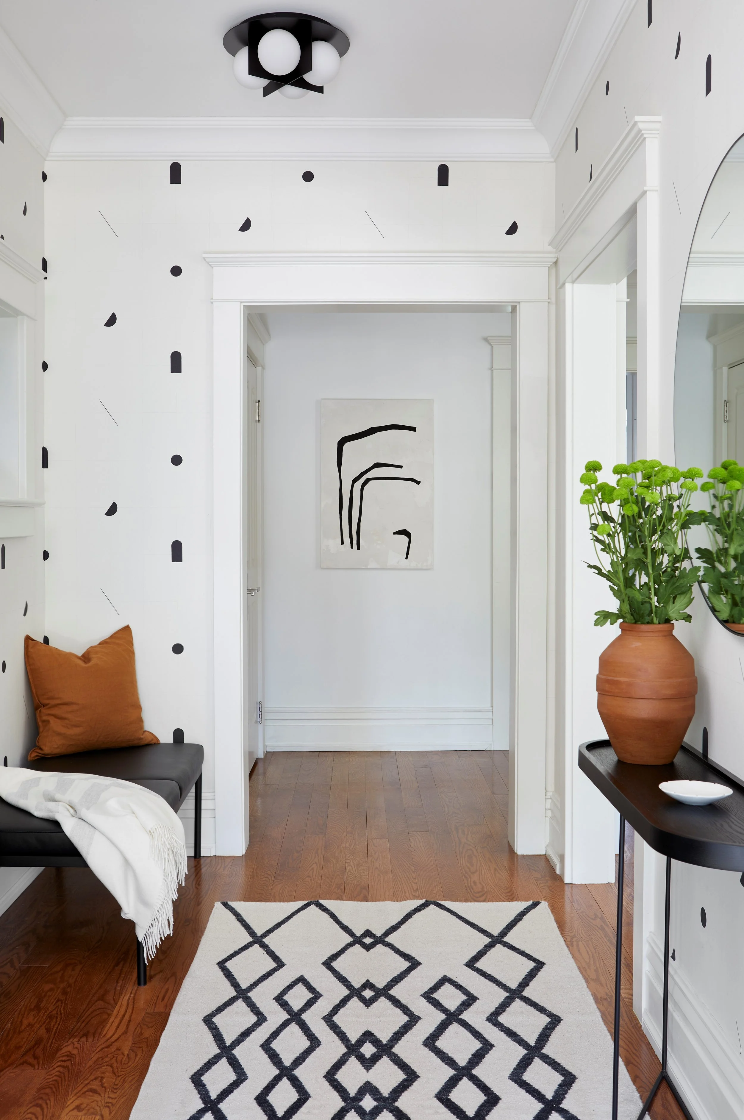
This one should be pretty simple as well. This is where we combine 2+ different elements together of that same format (colours, shapes, materials, etc), to arrive at a visually pleasing result. Our brains crave contrast. Think of how satisfying the black elements contrast in the above space which would be so uniformly white without them. The contrast helps the terra cotta and flash of green pop in it’s own contrast as well.
emphasis
design: Studio 1NINE1 / photo: Valerie Wilcox
This principal asks us to create one thing as a primary focus in the space. It could be a piece of furniture, an accent wall or in this case…a chandelier:).
Scale/Proportion
Ensure the size of whatever you are using matches the space you’re in. Have a giant wardrobe and a tiny bedroom? Not a good idea. Everything in your space should make sense together and be proportionate. Keep in mind all dimensions as well. Here’s another example: If there’s especially high ceilings, you should consider elements which reach a little taller to make sense in the space.
DETAIL
design: Studio 1NINE1 / photo: Valerie Wilcox
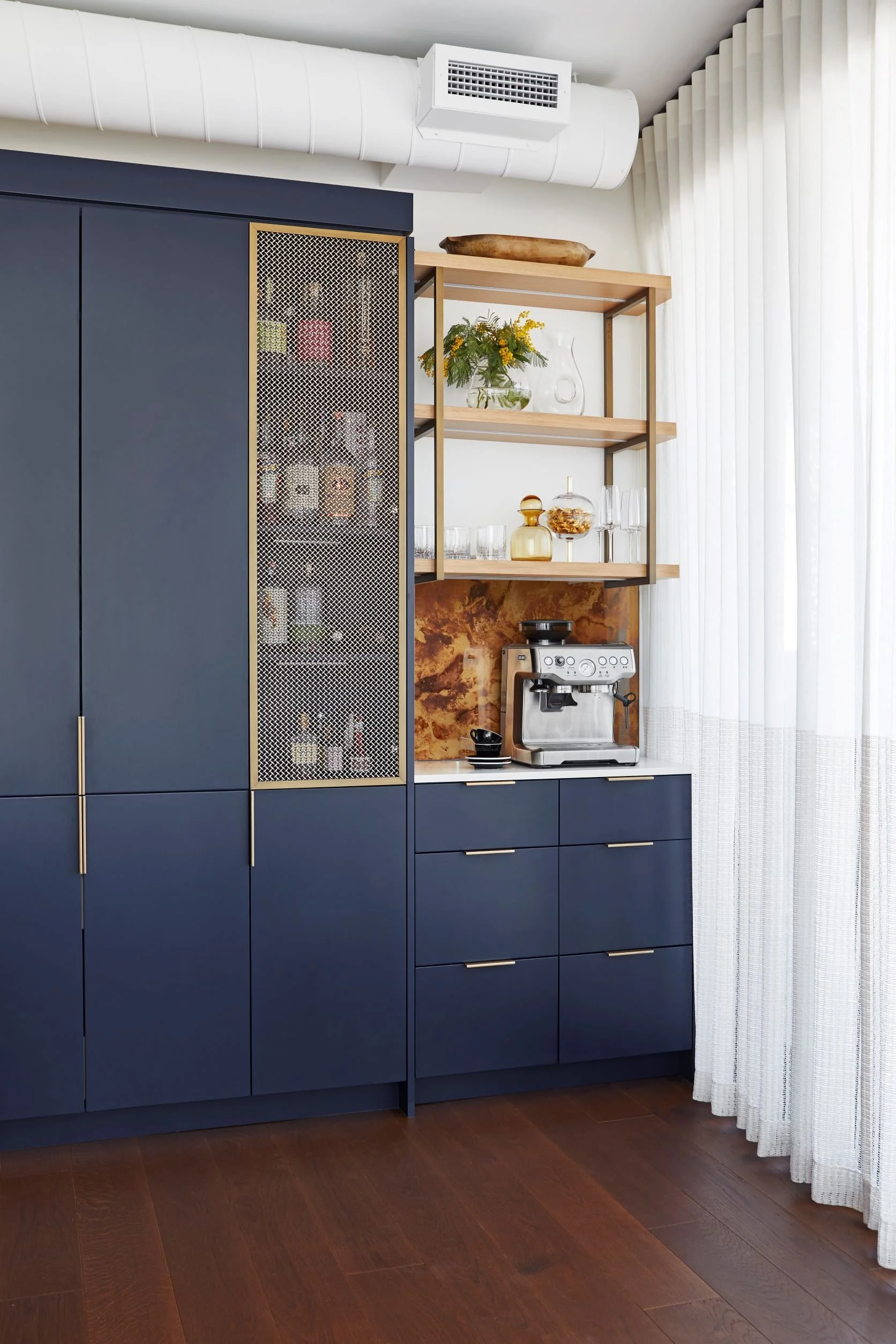
The details are where surprise and delight happens. Elements like a gold mesh cupboard door and caramel glass swirling like an espresso behind the coffee station. The more time paying attention to the fine elements - the greater the delight in the space, generally.
So there’s the principals all good designers keep in mind. As we mentioned, they’re pretty simple and THAT’s why it’s so hard:).
Connect with us if you’d like to speak about having us help with your next project HERE


