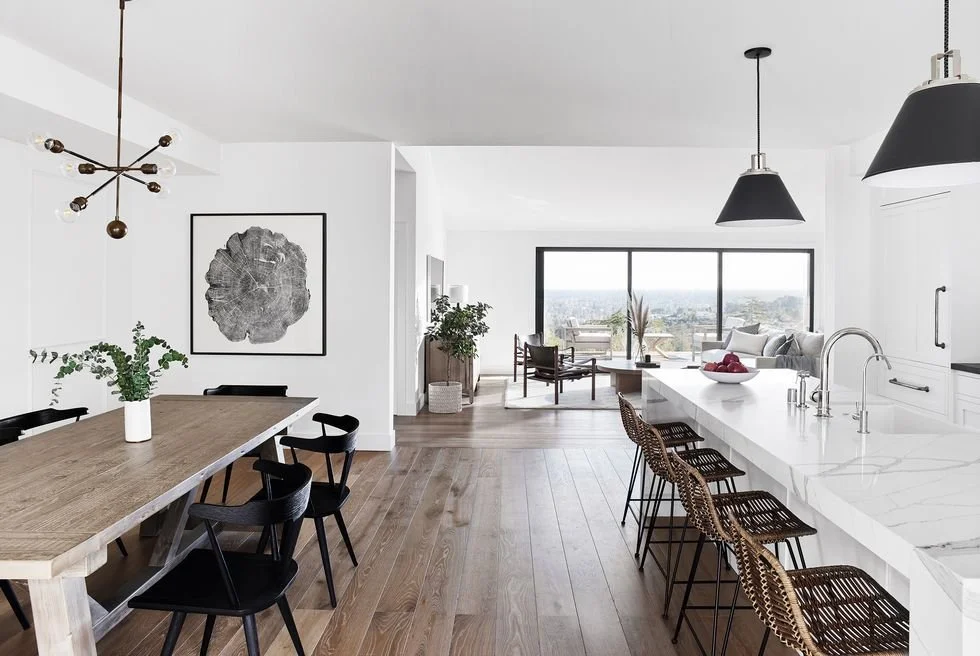
The beauty of Scandinavian design explained
The “scandi” look is one of the most enduring and sought-after design themes of all time. Done well, the look has a minimal heart with cozy elements to balance. As with so many design objectives - it’s a simple but not easy thing. We’ll break it down into it’s parts for all you scandi-files:).
CONTRAST
Photo: Elle Decor
Scandinavian design is HIGH contrast. Think of all those light, neutral spaces detailed by a deep black element. It’s the expression of this contrast that gives a clean and tidy feel to the Scandinavian look which is paramount for pulling it off.
NATURAL LIGHT
photo: dwell
Generally, natural light is a scarce in scandinavian countries outside of summer so there’s a good reason neutral, light pallettes are employed and should be. Big mirrors and large windows are key as well.
WOOD
photo: midj
Light wood is used liberally in scandi design with good results. Lighter woods lend warmth while still keeping things light to optimzine natural luminescence.
COZY FABRICS
photo: Architectural Digest
Let the HYGGE (Nordic notion of all-around feeling of coziness), in with fabrics. Your soft items (bedding, pillows, throws, rugs), need to agent the comfy factor in your design. Chunky and uber soft materials in soft wools, etc are ideal to soften the stark elements you’ve curated.
That’s how we get Nordic people. Click here to connect with our studio to realize your scandi dreams.


